When you read 10 articles about buttons, you get 10 slightly different answers. Is a CTA a button? Is a primary button a CTA? Are secondary and tertiary buttons also CTAs — or do they call too silently for a user’s interaction to be labelled “call to action”?
I recently had a live-talk about “Tokens Studio for Figma” and I got a lot of positive feedback for some of the things I said in the talk and in discussions afterwards, so I decided to write an article about buttons and how I was able to really holistically reapproach them, thanks to the requirements of token taxonomy and syntax.
When creating a component library with a design token system — especially a multi-branded and multi-themed one — you can’t simply define a few colors and rules, draw primary, secondary and tertiary buttons and their states and you are done. You have to think a lot more about hierarchies, behaviour, flexibility, expandability, distinguishability and a lot mor -ilities.
Especially the semantic tier of tokens reveals some hidden constraints and opportunities that we otherwise (maybeee) would have followed intuitively, but it’s nice to intentionally expose and celebrate them.
Semantic Tokens
Semantic naming — and in the context of tokenization “semantic tokens” — give a core layer of tokens — the “option tokens” — a meaning by implementing a design decision.
Those option tokens are basically a massive (but well thought-through) collection of colors, sizes, spaces, typography variants, etc. that one might need in a design system to cover the needs of all interactive touchpoints (devices, screen sizes, brands, themes).
On top of those option tokens, you define sets of semantic tokens (one per theme, e.g. brandA-web-light theme, brandB-app-dark theme, smartTV theme), that give those option tokens a purpose in their respective themes.
Here are some exemplary design decisions
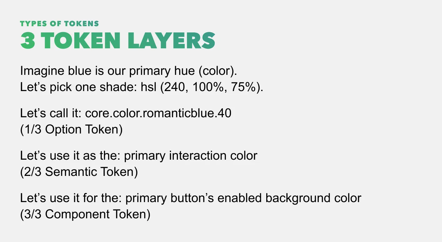
- core.color.romanticblue.40 → brandA.web.light.color.selectable.primary.bg
- core.color.bloodburst.80 → brandB.app.dark.color.selectable.error.canvas
- core.dimension.150 → app.space.container.inset.m
- core.font-size.300 → app.typography.title.xxxl
- core.dimension.100 → global.size.icon.s
- More to be found in my Figma template. You’ll need the Tokens Studio plugin to see the tokens.
The goal and also biggest benefit of semantic tokens are:They implement generic design decisions that can be mapped to several components on “component token” level — meaning one semantic token can be used in more than one or even a lot of components.
Why is that so cool? Because you will get more consistency, clarity, simplicity, distinguishability and thus a lower cognitive load, more patient, more successful and happier users and in the end — a better conversion. Besides changes to one design decisions will bulk-change all of its attached components.
Before we dive into the diverse colorful world of buttons, let’s get an overview where to find them.
Buttons — where are you?
In general, there are three types of pages (in the world (wide web), haha, bold
- __Overview pages __which contain collections of topics or teasers for the users to choose from. Usually they are take-off points into flows/funnels. Examples: “Homepages” and sub-homes in general, category and list pages of online shops, dashboards. They can also be called navigation pages. They don’t have that one CTA, they rather have a lot of quieter call to actions or offerings for the user.
- __Funnel pages __inside flows. Those try to focus the users attention on one task to finish in one or more steps. Sounds like they have that one primary CTA and maybe some quieter secondary elements to complete the task.
- __Information pages __which are neither overview pages nor pages inside a funnel — however they can be the final page at the end of a funnel. Examples: A user searches or filters a list of articles/contents and lands on the article/content page. Sounds like they don’t have many CTAs at all. The “action” those pages expect from the users are consuming information. And afterwards they may be offering more similar pages or flows (“you might also be interested in”, “related”).
Since overview pages and information pages don‘t sound like the most complex scenarios for buttons, let’s focus on “funnel pages” and the other types will be self-explaining then. Funnel pages are typically pages with some kind of lead/conversion at the end, e.g. subscribing to a service, buying a product, closing a contract or sending a simple message.
Ok, we found them, let’s look into what buttons and their other tribe members are.
Buttons — what are you?
Buttons are interactive elements. There are large and complex interactive elements like (in atomic design) organisms and molecules — and small ones like atoms, part of which are buttons.
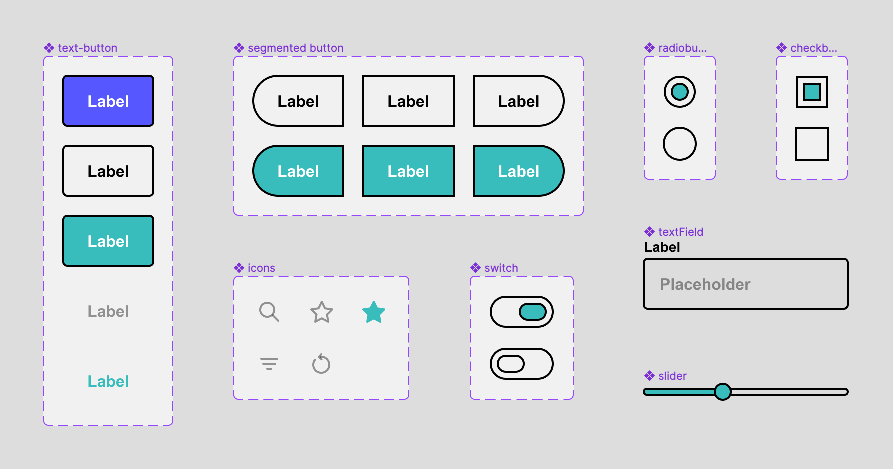
Other atoms are e.g. any type of components for forms like checkboxes, dropdowns, input fields, segmented buttons, radio buttons, several others and also any type of buttons like floating action buttons, chips, tabs, etc.
What do you use those small interactive elements for? To solve tasks. You make selections with radio buttons, segmented buttons and checkboxes, you change contexts with segmented buttons (aka tab groups) or dropdowns, you specify information with input fields … and you send/save something to a server with a button. Sounds like all of them do the job together, right?
So why lift buttons above everything else? Why not group all of those little helpers in primary, secondary and tertiary, depending on how essential they are for the user to complete a task and style them all consistently?
Larger elements (molecules and organisms) consist of atoms, so if we solve the scenario with atoms, we automatically solve it for all larger elements as well.
Thesis: One style for all primary atoms, one for all secondary, one for all tertiary.
Nooo, why would you do something like this?
More Consistency, Clarity, Simplicity, Distinguishability
If you minimize the amount of different font sizes, spacings, colors and other characteristics/tokens needed to create correct visual hierarchies and intuitive components, you maximize consistency, clarity, simplicity and distinguishability. This will result in the lowest possible cognitive load, in more patient, more successful and happier users and in the end — a better conversion. (Yes, I copied that from above. Let it sink, let it stick.)
Ok, let’s minimize the amount of tokens now to maximize all of the above with the use of semantic token naming.
Atomic Semantic Tokens
Atomic, because we are talking about small interactive elements: atoms. Semantic tokens, because we want to tokenize design decisions and apply them to all related elements equally so they convey the same signals, priorities, feelings of belonging.
Here is a link to a Figma template with all of the tokens I describe below. Play around with it, it’s a lot easier to understand like this.You’ll need the Tokens Studio plugin to see the tokens.
Primary Elements
The most important category of interactive elements are “primary”.

Since a user should only have one task per step/page (or in general: context) in a conversion funnel, the primary action should be used to submit/send/save the completed step. This results in one primary action which is in most cases the primary call to action aka the primary button. The primary button has several states (hover, pressed, focused, inactive), but no selected state. When the button is invoked, the task is sent to validation and either returns an error or success with a new context (step/page). To signal the user where to complete the step, we should reserve a special color for the primary action, the primary color.
Conclusion: Each page in a conversion funnel should ideally have exactly one topic with one task and therefore exactly one indispensible primary element — the call to action in the primary color.
In Tokens Studio: Create one primary color and a contrast color as semantic tokens and assign them to all components as component tokens that will be used as primary elements (hint: most likely only buttons).
I know, no real news until here …
Secondary Elements
This is where it might get a little fresher. What are secondary elements? They are less important than that one primary element, but mostly necessary for a user to complete a certain task. The user should spot them, understand them as elements providing vital functions — and put them all in the same drawer that is labelled: “I need to consider those for completing my task.”
This way the user can scan a page with very little cognitive load and understand: This is my task, this is the primary call to action to submit my task and all of those secondary elements are vital to complete the task.
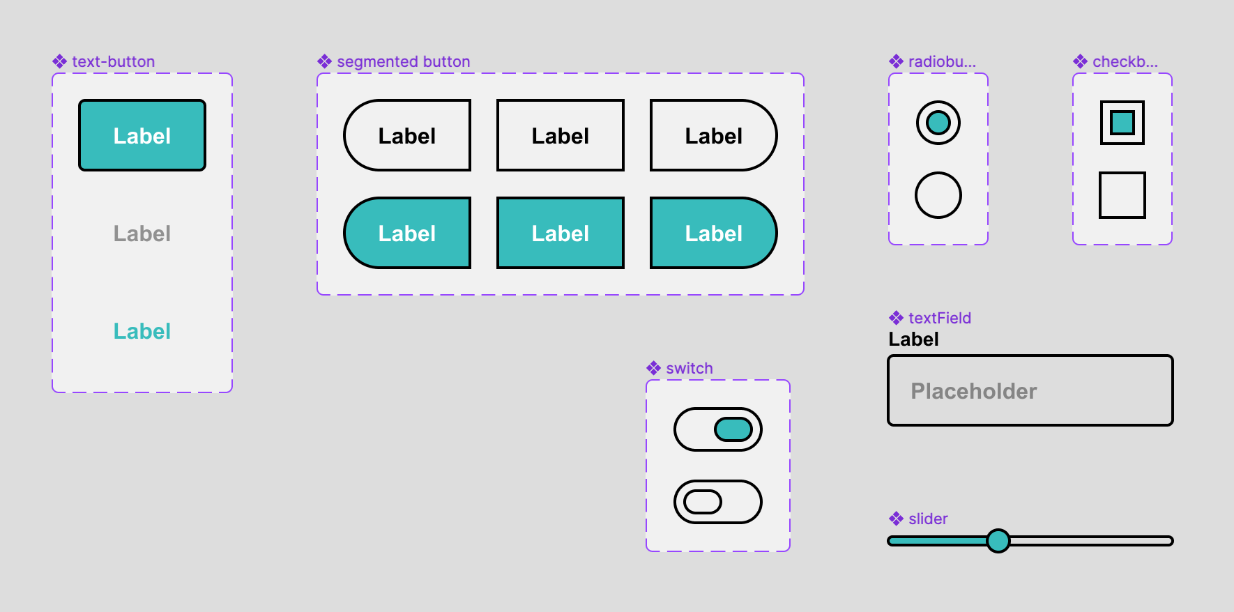
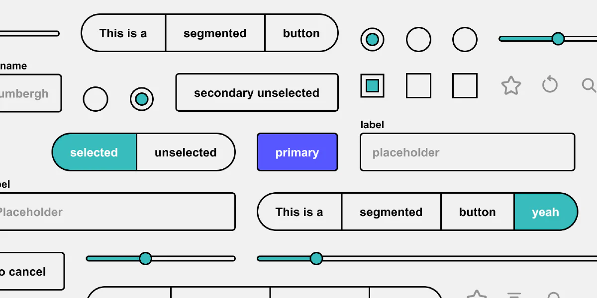
Examples: text buttons, icon buttons, chips, menu items, radio buttons, segmented buttons (tabs), sliders, switches and checkboxes, date/time pickers, dropdowns (basically text fields with an icon on the right opening a menu) and even text fields, yes, text fields (depending on how you style them in comparison to secondary buttons).
All of them have several states (hover, pressed, focused, inactive) and (in contrary to the primary element) also a selected version with the same states.
Scenarios: a step in a process where a user has to fill out a form, configure a product, customize a setting or submit comment.
So if all those secondary elements have the same importance — why not style them the same way? You probably did it intuitively, but creating your components consciously with that in mind will reduce the number of design decisions and tokens and make your design easier to understand for users and even other designers working with your design system.
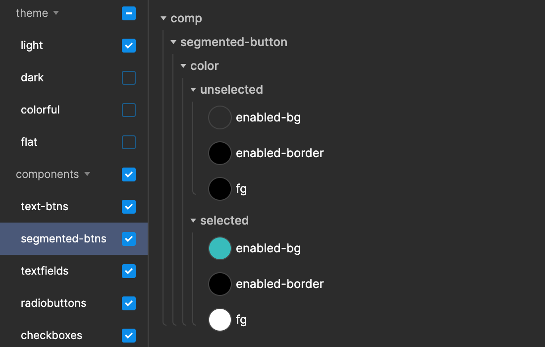
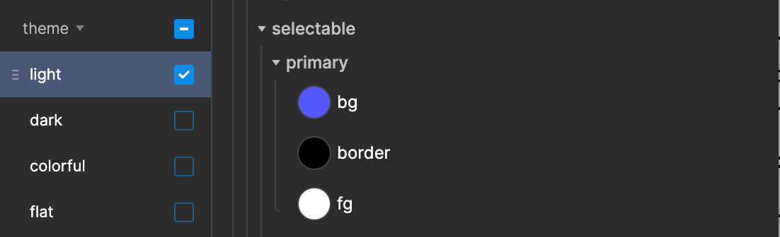
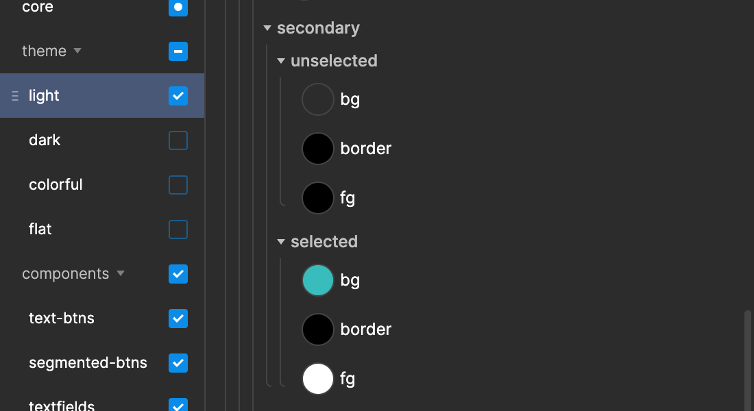
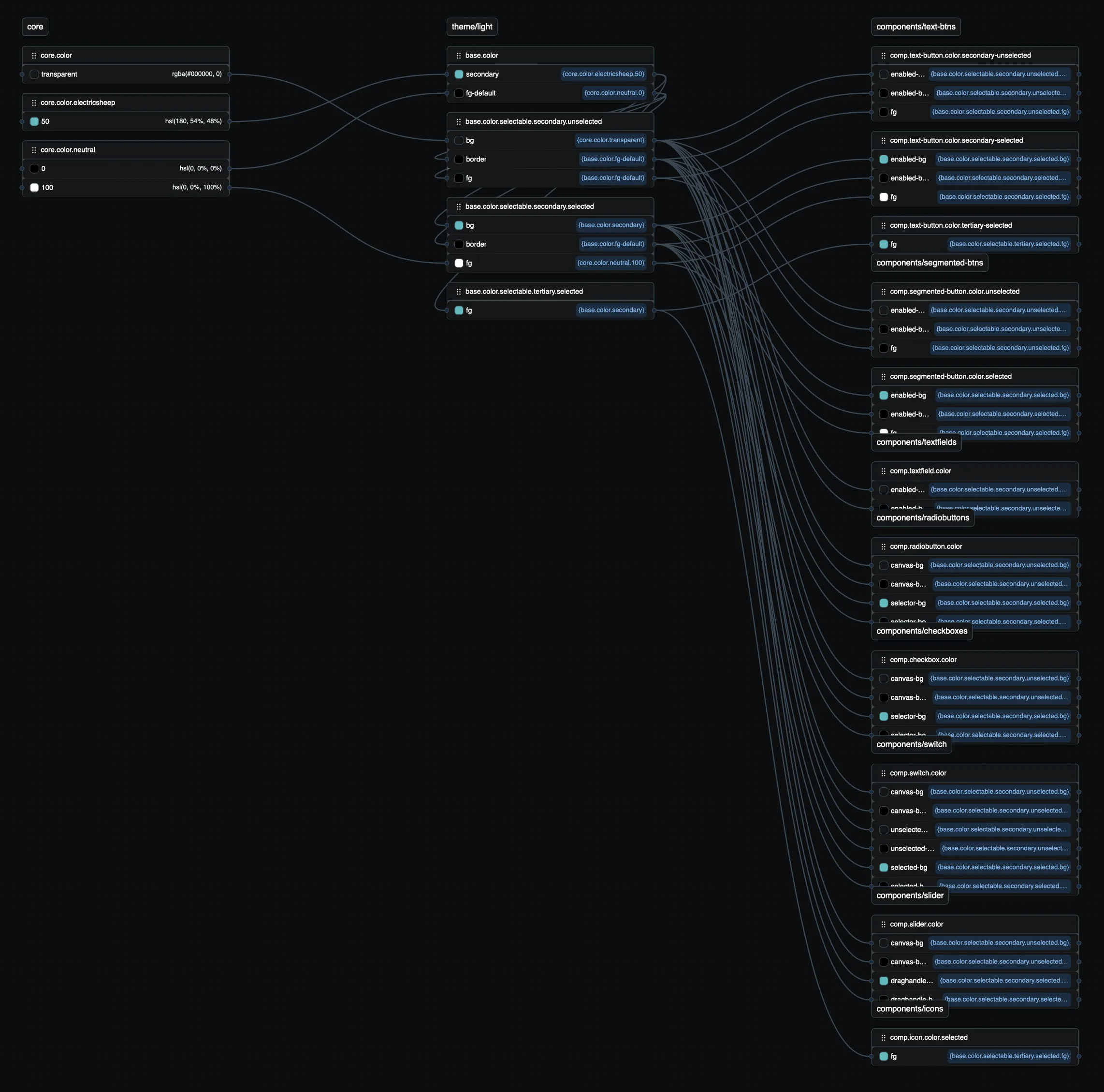
In Tokens Studio: Create two secondary background colors as semantic tokens, one unselected and one selected state, create a border and a contrasting foreground color for each state that “could” be used on top of the background colors and use these semantic colors in all components that will be used as secondary elements. On component level, you can assign those semantic tokens to whichever part of a component (background, border, foreground, text, icons) you want. If a color you need seems not to be defined as secondary semantic, it might be higher up in the semantic hierarchy (fg-default, fg-weak, bg, canvas). When you are unsure what semantic colors to assign, think about dark mode or a colored mode (Spotify-style) with colored text and components, e.g. pink background, brown text, that might help.
Open Token Flow and type “secondary” into the search field to get the diagram below. There you can see how semantic tokens can be assigned flexibly to component parts.
(All of the above applies to “funnel pages”. On non-funnel pages (overview pages, information pages), since there is not that one primary element, you could say that the most important category of interactive elements are secondary.)
Tertiary Elements
The last category are “tertiary” elements. Tertiary interactive elements are most of the time contextual and optional functions on any type of page. Visually they are mostly ghost buttons (no border/background), so text and/or icon buttons.
Examples: share, like, star, heart, bookmark, download/save, sort/filter, duplicate, more, vertical ellipsis or chevron (with a context menu).

These elements don’t have to be seen and interpreted by users when quickly scanning a page and its purpose. They are there when a user wants to interact with an element, mostly with molecules and organisms. They even shouldn’t be too prominent, since they will increase the visual noise and compete with everything else (more important) on a page.
In Tokens Studio: The setup is identical to the secondary buttons. Depending on the function of the element it might have a selected state (e.g. star/unstar) or not (e.g. share).
Disclaimer
The Tokens Studio template file is the easiest version you can do. If you have a very complex or colorful UI, the minimalist approach might be just not enough. Then try to define one or two more semantically named colors for primary, secondary, tertiary and assign them to whatever part of components you need. That should be enough. I also skipped creating interactive states. If you are interested in where to put them, check out this file and my talk.
Conclusion
Maybe all of this wasn’t all that new to you. Maybe you already did everything intuitively like that. Good for you. My goal with this article was to improve your awareness to be really conscious about your design decisions. Making intentional design decisions, especially when you are able to consolidate and take things away, really improves the performance of your application.
“Perfection is achieved, not when there is nothing more to add, but when there is nothing left to take away.” — Antoine de Saint-Exupéry, Airman’s Odyssey
In the beginning I said: When you read 10 articles about buttons, you get 10 different answers. This was the 11th one. 😄 I hope you liked it. Let me hear in the comments.