Our Case
Let’s say we have two brands: Brand X (bx) and Brand Y (by). They have different look-&-feeling online shops with different corporate identities and style guides including own colors, typography, handling of whitespace, aesthetics, round vs. angular, flat vs. 3dimensional, outlined vs. filled, …
On top of two different corporate identities, modern websites nowadays are offered in light and dark themes, depending on the user’s preference and time of the day. So in total we have 4 themes: bx light & dark, by light & dark. And as a consequence, we’ll have to deliver most of the components for their design systems in these 4 themes.
But where do we start? How do we craft exhaustive and maintainable components? Is there a main theme from which all other themes are derived? Is there a neutral base theme that can be transformed into our 4 themes? Let’s have a look …
🤓 Disclaimer: This article would be 100 pages long if I would deep-dive into every topic it scratches. So instead of writing 100 pages about everything, I’ll focus on the “Design Token System” part, but give you awareness about many other important aspects, by mentioning them.
Crafting Components
A good strategy is to create base components with maximum complexity. Let’s say a product card that includes all possible badges, banners, price tags and specifications – aka the “worst case” complexity. The reason for this is, that in instances (and variants) of components, you can remove items, but not add them. So if you need a maximum of 3 badges in a component (NEW, SPECIAL PRICE, FEATURED), you have to add all 3 in the base component. Removing some or all will work, but adding won’t.
Themed vs. Neutral Base Components
All of those base components can either be done in the main theme or in a neutral style.
A neutral style could be created by using one of the brand’s neutral looking font faces, neutral greyscale colors and average metrics (margins, paddings, elevation, borders, shadows, roundness, …). It might end up looking like wireframing components.
The advantage is that you treat all of the 4 themes equally and wireframing and developing new features and flows with those components will have a better focus on UX, rather than distract with its UI.
The disadvantage of a neutral theme is that you produce overhead, so in total 5 themes.
Creating Design Tokens
When creating design tokens for a brand, you should have the brand’s style guide ready to hand where colors, typography and the general aesthetics and use of whitespace are defined. You can interpret the use of whitespace for defining metric tokens (margins, paddings, elevation, borders, shadows, roundness, …). Depending on the quality of the style guide, you might even have semantic colors (background colors, text colors, badge colors, …) ready to use. Throw in a number of shades and a cascading set of typography scales and you are half way there.
Going into every single aspect of transforming a style guide into a comprehensive design tokens would blow up this article, so instead, I’ll hand out to you a hierarchical dictionary of common design tokens for you to use. This way you can play a game of “connect the dots”: You have your style guide on the one side and a hierarchy of possible design tokens on the other.
I recommend creating a spreadsheet (like the one below) and testing out a few dozens of tokens to get a feeling if you are heading into the right direction. But first …
Types of Design Tokens
Let’s have a look at possible types of design tokens. What types are needed to define a brand’s look and feel?
- Color: When defining color palettes, a good start is to choose one of the strategies below:
- Rainbow Palette: An evenly spread palette of a full rainbow of colors, similar to the well-known 2014 Material Design color palette with roughly 19 tones with 14 shades each. This palette mainly existed to give all brands and designers in the world (slight exaggeration) enough colors to choose from. Too many for your project, so it’s wiser to choose another strategy …
- Focused Palette: A limited palette of colors with a fixed set of hues and saturations that reflect your brand. For example 5-10 hues in vibrant, pastel or subtle tones and 10 lightness shades each. This is based on the rainbow palette, but with fewer selected colors.
- Here is an example for a blue tone with a hue of 210:
$colors.blue._hue: 210; - To define shades of blue, you have to choose a saturation and a number of lightness values. In code, it would look something like this:
hsla($colors.blue._hue, $s, $l, 1)$s: Fixed or variable saturations: Vibrant → 100%, pastel → ~40%, subtle → ~10%$l: Full range from 100 to 900 and 90 to 10% in lightness
- So you might end up with 5-10 different hues with a fixed saturation (
$s) each and for each of those 5-10 colors a number of shades ($l), so in total 50-100 colors. It’s less colors than the full rainbow palette above, but still: Some of the lightness shades won’t be used so it’s kind of useless and reckless to have them in your palette, because: If a color is defined, it might be used by your designers.
- Here is an example for a blue tone with a hue of 210:
- Limited palette: The best strategy might be to only define a very limited palette of colors that are really needed. The downside of this is: You’ll have to think everything through before you define all colors. You’ll have to go through all cases and combinations regarding aesthetics and accessibility (btw: I love https://contrast-grid.eightshapes.com/ and http://www.myndex.com/APCA/). Where should you start? Define some meaningful semantic color tokens such as (page-bg, card-bg, primary-selectable-bg, secondary-selectable-bg, heading, body, …) in your light theme, place all on a page to see if they work and evolve from there.
- Cool tools to create color palettes: https://colorbox.io/, https://contrast-grid.eightshapes.com/, https://meodai.github.io/fettepalette/, https://leonardocolor.io/, https://color.adobe.com/
- Typography: There is a lot to say about typography, but above all there is one basic rule: Keep it simple and distinguishable. Same as for tokens: Only introduce a new font style if you really need it. Common typography parameters are: Font family, weight, size, letter/word/line/paragraph spacing, case, decoration. Cool tools to create type scales: https://type-scale.com, https://www.layoutgridcalculator.com/type-scale/
- Sizing, Spacing, Border Radius, Border Width: All of these metrics can either be defined in pixels or rem. rem is a base size used in HTML and equals 16 px. And 16 px is actually a good value, since body text and basic spacing is often 16 px. To use it, define
rem = 16and add it to the “sizing” section in Figma Tokens. Whenever you are defining spacings, margins and paddings now, you can now use “rem” instead of “px” which might make it easier for you and your developers in discussions. Border radius and width are fine in “px”. - Opacity, Elevation, Shadow: These parameters add hierarchy and focus to your design (same does size, contrast, whitespace), so use them wisely.
- Beyond all of the above tokens you could even define some for things like: Breakpoints, Touch, Time/Animation/Duration, … But again: Keep it as simple as possible.
REM & SCALE & scale
To be more flexible and able to play around with my tokens, I like to add multipliers to some of my tokens. Here are a few examples:
Add a global REM = 16 token and add it to your font-size tokens as font-size-abc: $REM/16 * xyzso you can change all font-sizes by simply changing the global REM.
Add a global SCALE = 16 token and add it to all of your size-related tokens like sizing/spacing/dimensions in the same manner as for REM, so you can change all other non-font-size-related sizes.
Add a local scale = 16 to other groups like border-roundness or border-width so you can easily change the look of your design by applying a different scale to relevant groups of tokens.
You might have asked yourself up there why I didn’t define the base text size for body as 1 reminstead of 16 px. I’m a fan of integers and getting a 14 px font size from a multiple of 1 rem is simply nasty. And I got used to specifying font sizes as 12, 14, 16, 20, … plus they will be tokenized anyways and get their semantic names like xs, s, m, ml, … Adding base scale multipliers to cascading tokens is quite nice in general and helps with flexibility.
Layers of Design Tokens
When talking about design tokens, there are basically 3 different categories. A lot of designers have different names for these three layers, but all of them are talking about the same 3 categories:
- Option Tokens (aka Core Tokens): These are the most fundamental layer of tokens. They don’t have any meaning, function or design decision implemented into their names, e.g.
$color-blue-500or$size-8. It’s likemanorlemon. vs.fatherorvitamines. Think of them like all possible basic ingredients. - Semantic Tokens (aka Alias/Base/Brand/Decision/Theme Tokens): Use them to define global meaning/function/appearance aka a design decision, e.g.
bx-selectable-primary: $color-blue-500;orbx-base-typography-heading-xl: $bx-base-typography-heading-m * 2;. Think of them like a global brand style or a base component (vs. an instance). - Component Tokens: These are the most specific ones, the top layer of tokens. Use them to apply your generic design decisions (from semantic tokens) to specific parts of your components, e.g.
bx-light-web-selectable-color-bg-primary-hover.Think of them like an instance of a semantic token. You can use a semantic token (similar to a base component) in many different places, but depending where you use it, it will have a different purpose.
Here is an example:
Let’s say we have a palette of colors for our brand. One of them is a standard blue: $color-blue-500 with a hex-value of #0000FF.
This blue is also the primary color for our light theme design (besides probably black text, a few greyscales and a white background). To define a semantic token for this we say: bx-light-color-primary: $color-blue-500;
Coincidentally, blue is also a good color to highlighting links and buttons, so we create a component token for it to be used in Brand X’s light theme: bx-light-selectable-color-primary: $bx-light-color-primary; So now, whenever we need the primary interaction color, we simply use: $bx-light-selectable-color-primary.
Should the brand’s blue value change one day, we would change it’s option token: $color-blue-500: #3300FF; and all uses of blue are automatically updated. Should the brand’s color palette stay the same, but a designer decides to use the brand’s purple instead as the primary interaction color, we reassign the component token: bx-light-color-primary: $color-purple-500;
What if we have different colors for our interactions for different states though? Let’s define a component token: bx-light-selectable-color-primary-default: $bx-color-primary; This means that in the light theme of our Brand X, whenever there is a primary selectable (like a text link or button) then it’s blue.
And when we hover over it? bx-color-primary-hover: $color-blue-600; and bx-light-selectable-color-primary-hover: $bx-color-primary-hover;
This is a very simple example, but it shows two interesting things:
- It’s nice to have meaningful names for tokens to understand design decisions.
- It’s super convenient to change design decisions and all dependencies are automatically updated (if done well).
Hierarchy & Syntax of Design Tokens
Now, let’s have a deeper look into the names of these tokens. Design tokens are structured in a tree (similar to folders or indented bullet-point-lists) by using “-” as separators. Common variables for tokens are:
- A blue color token:
color-blue-500 - A primary brand color token for Brand X:
bx-brand-color-primary - A large heading for Brand X:
bx-base-typography-title-xl - A hover color for a primary button for the light theme of Brand X:
bx-light-button-color-bg-primary-hover
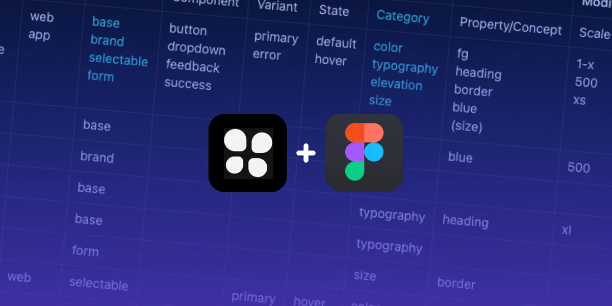
To give you a feeling of what’s possible, study the table below:
- The first line are the top-categories (Namespace, Object, Base, Modifier).
- The second line are the sub-categories (System, Theme, Domain, …).
- The third line are examples for possible elements.
- All lines below are examples for tokens. Read them from left to right and imagine “-” between the variables, similar to the examples above.
- The red columns are mandatory (or recommended to be mandatory), black columns are optional.
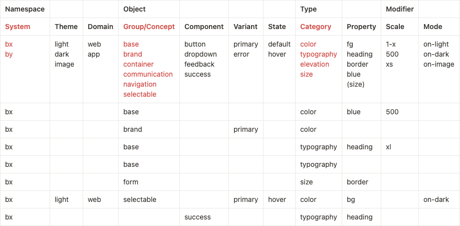
Now that you have an idea how tokens can be named and structured, let’s look into the details of each category.
This set is a “Best of” and “Remix” of a lot of articles and videos about Design Tokens. Probably the most comprehensive one was written by Nathan Curtis: Naming Tokens in Design Systems. You should definitely have a look at it. It has a lot more details on this topic.
- Namespace
- System:
bx,by - (Optional) Theme:
light,dark,image - (Optional) Domain:
web,app
- System:
- Object
- Group/Concept:
brand, base(alternatively if you don’t have abrand),navigation,content,selectable,form,footer, … - (Optional) Component:
button,dropdown,feedback,success,deliveryStatus, … - (Optional) Variant
primary,secondary,tertiary(akaghost)success(akaconfirmation,positive)error(akaalert,critical)infowarningnew
- (Optional) State
default,hover,press,active,visited,focus,disabled,error
- Group/Concept:
- Type
- Category
colortypographysize(akasizing),spacing,border radius,border widthopacityelevation(akashadow,depth)breakpointstouchtime(akaanimation,duration)
- (Optional) Property
- For color:
notification,success,fg,unavailable, … - For typography:
heading-xl,body-s,size,caption, … - For sizes:
size,border, …
- For color:
- Category
- (Optional) Modifier
- (Optional) Scale
- Enumerated values like heading levels
1,2,3,4and5. - Ordered values like Google Material color levels of
50,100, …,900 - Bounded scales like HSL’s 0 to 100 lightness value
teal-10(dark),teal-50(medium),teal-100(light) - Proportion, often establishing a base
1-xand growing (2-x,4-x, …) and shrinking (half-x,quarter-x, …) relatively - T-shirt sizes, starting with
small(akas),medium(akam,standard,default) andlarge(akal) and expanding toxl,xsandxxxl
- Enumerated values like heading levels
- (Optional) Mode
on-light,on-dark,on-image
- (Optional) Scale
Guidelines
Some of the above tokens and their use is quite obvious, some will only make sense once you have developed your first umpteen components. Here are a few basic guidelines for creating tokens:
- Use the above tokens list as a dictionary and only pick the ones you really need multiple times. You won’t need all of them.
- Start with a small list of:
- Colors (page-bg, card-bg, primary-selectable-bg, secondary-selectable-bg, headings, body)
- Typography (heading-l, body-l, body-m, body-s)
- Spacings (4 px, 8 px, 16 px, 24 px, 32 px, 48 px, 80 px)
- All semantic tokens are derived from option tokens.
- All component tokens are derived from semantic tokens.
- Don’t use option tokens in your designs, only semantic and component tokens.
- Use semantic tokens (for more generic design decisions, like e.g. your primary interaction color) and component tokens (derived from semantic tokens) for how and where to apply to which parts and stated of components.
- Add base global “REM”, global “SCALE” and local “scale”s multipliers early in your project. Adding them later is error-prone and cumbersome.
- Start with a really holistic option token set covering all brands, themes and interface sizes (devices and breakpoints), adding option tokens later won’t work.
- It’s ok to drag columns left and right in the tokens table to change the order of your syntax. Some orders might be better readable (
bx-light-button-color-bg-primary-hover), some more hierarchically “correct” (bx-light-button-primary-bg-color-hover) and some will make your notation and variety slimmer than others. Also some orders make more or less sens for option, semantic and component tokens. Play around a bit and use the one that feels best for you.
Wrap Up
That’s it. Now you have some good fundamental knowledge of how to set up your “Design Token System”. Like with every new language, it takes time and practice. Allow yourself to play around (the table is really good for it), test a lot, explore new looks and styles just by changing REW, SCALE and scales.
Depending on your use case, different tokens and hierarchies will work better or worse than others and it’s almost impossible to be right about all decisions until the end.
If you have the possibility, talk to your design and development team openly about all the pros and cons of different variants, you need to get everyone on board so your “Design Token System” will be understood and used.
💫